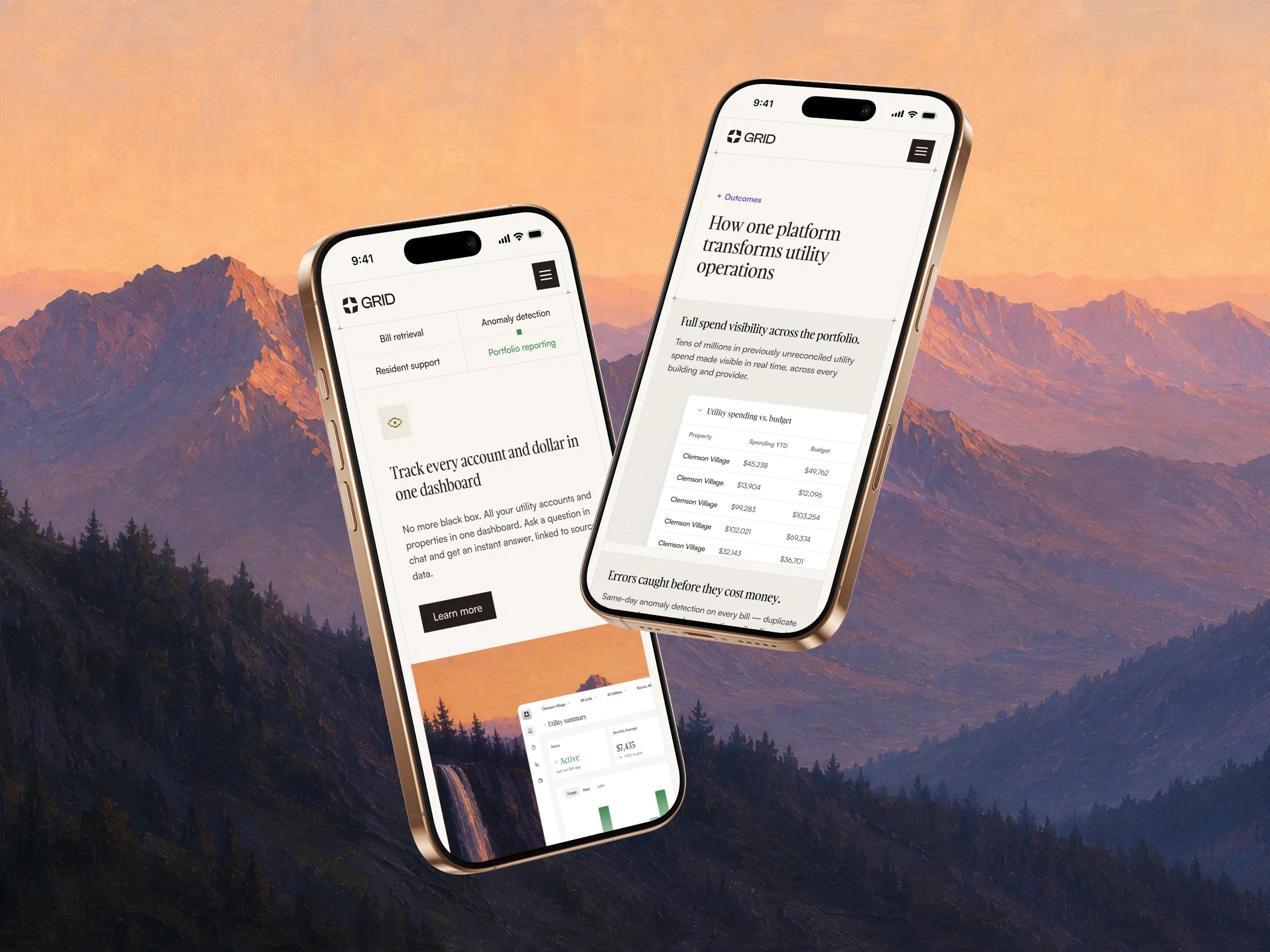


















A pre-launch startup with a blank slate and big ambitions
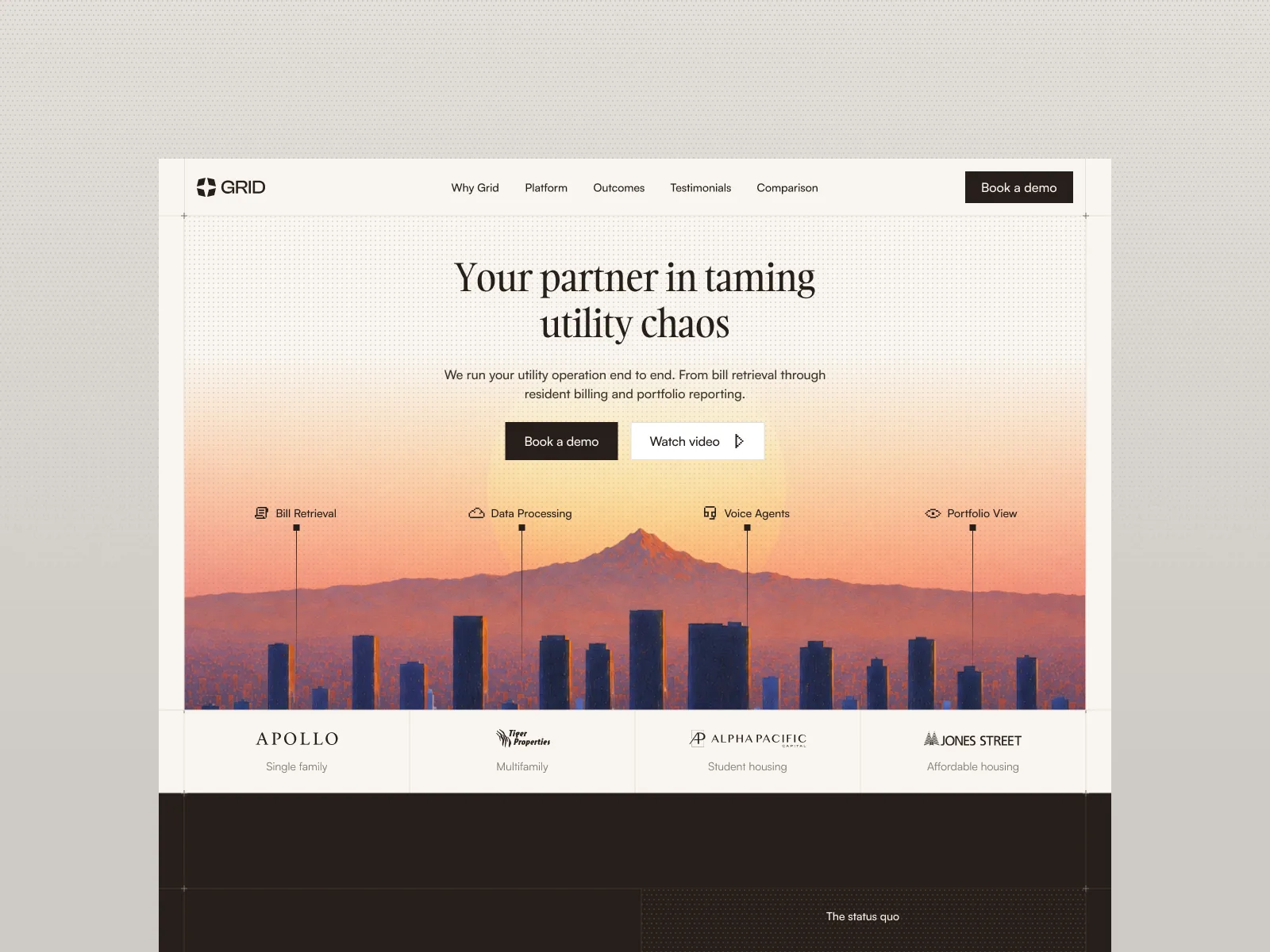
Grid is an AI-native platform for managing utility bills across large real estate portfolios, a job still done by hand almost everywhere, mostly through Conservice - the category's long-standing leader. Out to prove the old way is finished, Grid came to us with a working product that needed full branding, messaging and a website.


Building a brand to challenge the category's dominant player
- 01
Proving the old way is broken
Conservice manages utility bills for large portfolios with people rather than software, and nobody has seriously challenged that, until Grid came along. Their brand had to visually argue the new AI-native approach is the future, without looking like every other AI startup.
- 02
No brand to build from
Besides a working product and a logo pulled from an off-the-shelf Figma icon, Grid didn’t have much else in terms of branding. A proper logo, typography, color and photography direction all had to be created from scratch.
- 03
Explaining a complex product in <60s
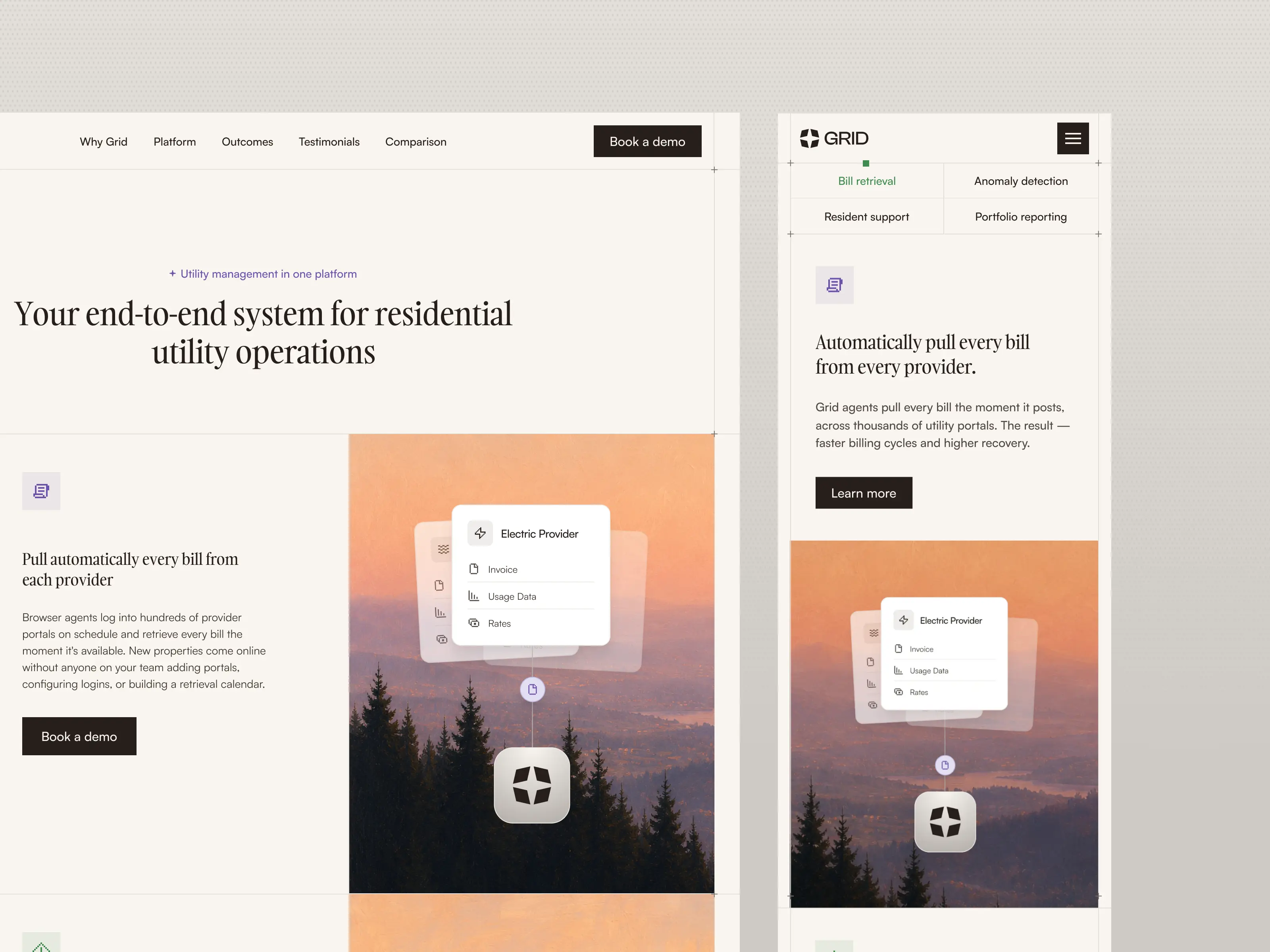
Browser agents and voice AI handling bill retrieval, allocation and anomaly control is a lot to take in. Enterprise buyers had to understand it quickly, without abstract AI iconography or screenshots that mean nothing out of context.
Ten weeks from a blank page to a live site
Narrative-informed design
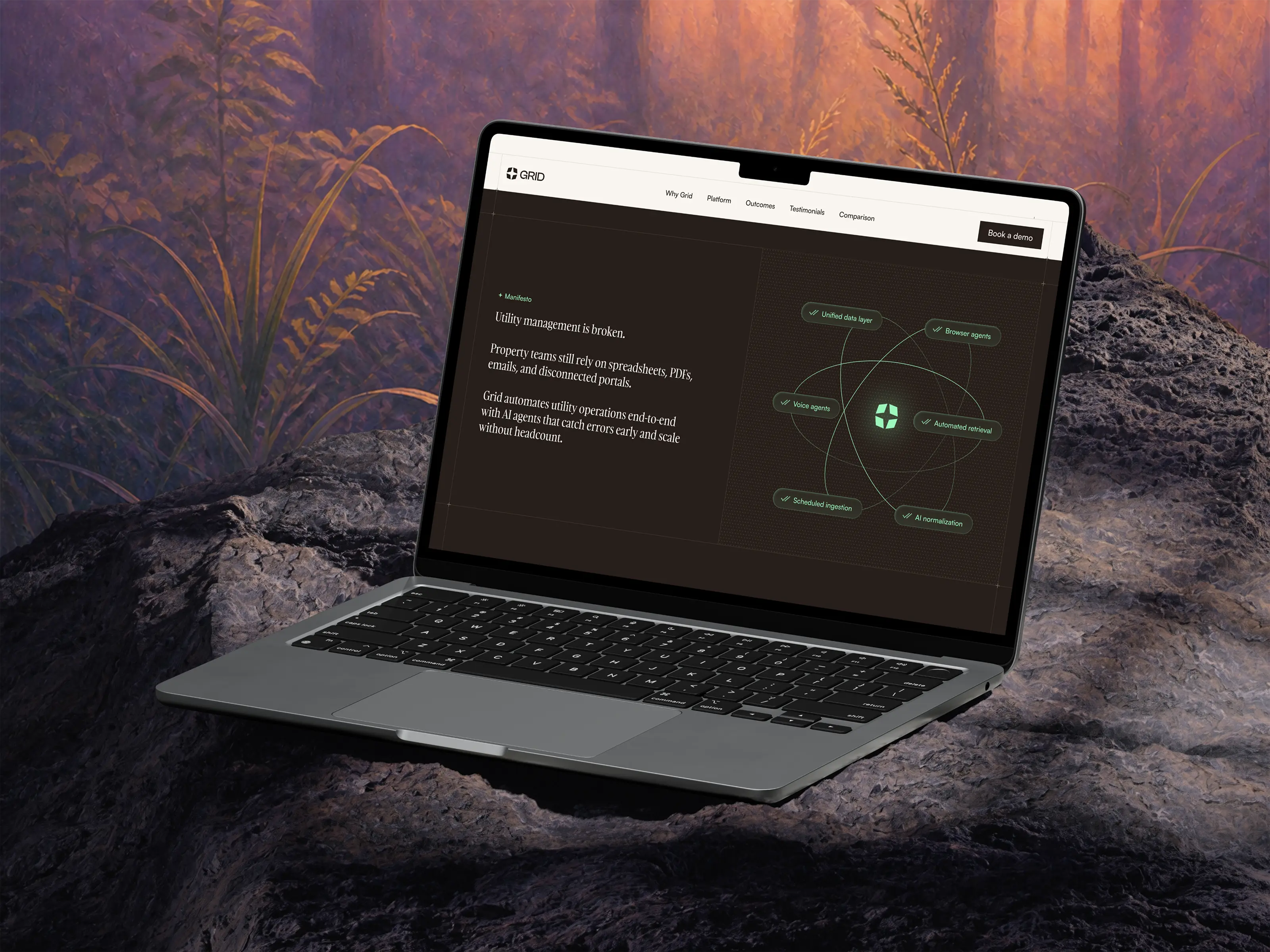
During a product marketing session we came up with Grid's narrative for the page, from the founder video at the top to the closing CTA. Every claim is backed by a real number, and Conservice only gets named once, near the end, after Grid's own case has been made.
A visual language built on the name itself
A monochrome, brownish base carrying Grid's original green accent, with painted architectural landscapes and geometric grid structures running through it. The serif and sans-serif typefaces are deliberately mismatched, and the logo became a rotating star that opens out.
Product animations instead of screenshots
Rather than raw screens that mean nothing without context, we built lightweight mini-demos from Grid's own demo environment, each showing a single real workflow. A comparison table against Conservice closes the page, working as both a conversion device and an SEO asset.